Wordle cheating with R
This post is not really about cheating Wordle, it’s about how to produce quick documents that include nice graphical representations of small sets of numerical data. A common scenario is in looking at the distribution of marks across a batch of assignments – has this group of students performed better than another, have I been particularly generous with my marks compared with last year, that kind of thing. Teachers assess all the time, and will often then obsess over just how objective they have been about it. A picture of the marking data can offer a clearer insight than just a table or list of numbers.
R
I’m not going to address installing R on your machine. There is a lot of very good information on how to do that.
Quick and dirty boxplots
So, I finished marking a small batch of essays and want to see how the cohort have done overall, beyond my subjective feeling that they did OK. From a terminal, start R:
$ RThis will start a session and tell you which version of R you are running. Now, it’s just a matter of typing in your numbers. They don’t have to be in any particular order:
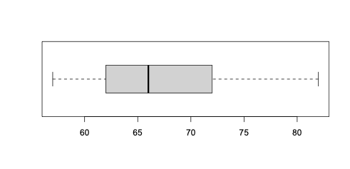
> boxplot(c(57,82,68,64,62,72),horizontal=TRUE)This will make a nice boxplot showing that your intuitions were OK. Doing well, with a reasonable median (the thick line).
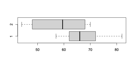
If you want to compare 2 sets, give R 2 vectors (a vector is a list or collection of data, constructed thus c(43,44,56,76)):
> boxplot(c(57,82,68,64,62,72),c(64,44,48,55,70,68),horizontal=TRUE)Reusable histograms
You might want a template to re-use for different data, or for data that you want to update from time to time.
The NY Times Wordle app asks if “Something doesn’t look right”. To me the plot looked a bit skewed towards the stupid end, and so I decided to play with the app to make my stats look symmetrical. I do the puzzle every day in a web browser, find the answer, and then do it again on a different machine – the one that stores cookie data and remembers my stats.
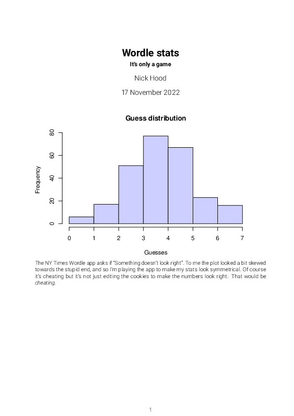
For this, I created an R markdown document which contains both text and images, calculated from the figures in the document. You can use any text editor to create the document (I use MacDown) but make sure the file extension is .Rmd, so that R knows to process the R code blocks. Here’s the source of the Wordle.Rmd file containing my dishonest stats. They are in the brutal lines constructing the vector of guesses, for example, these show that I have guessed the word in 2, a total of 17 times:
---
title: "Wordle stats"
subtitle: It's only a game
author: Nick Hood
date: \today
output:
pdf_document: default
documentclass: scrartcl
lang: en-GB
papersize: a4
fontsize: 11pt
geometry: margin=2cm, bindingoffset=0.5cm
pagestyle: headings
fontfamily: roboto
fontfamilyoptions: sfdefault, light
---
::: {.cell}
::: {.cell-output-display}
{width=672}
:::
:::
The NY Times Wordle app asks if "Something doesn't look right". To me the plot looked a bit skewed towards the stupid end, and so I'm playing the app to make my stats look symmetrical. Of course it's cheating but it's not just editing the cookies to make the numbers look right. That would be *cheating*.We can now send this file as a script to R:
$ Rscript -e "rmarkdown::render('Wordle.Rmd')"which produces a pdf document (see the output option in the .Rmd file) that looks like this:
Summary
Not the solution to the biggest problem, but I found it useful for making nice graphical images from small data sets. R is perfect for that, and this gets you started without too much fuss. Try copy-pasting the boxplot into an email next time you discuss marking assignments with colleagues.


